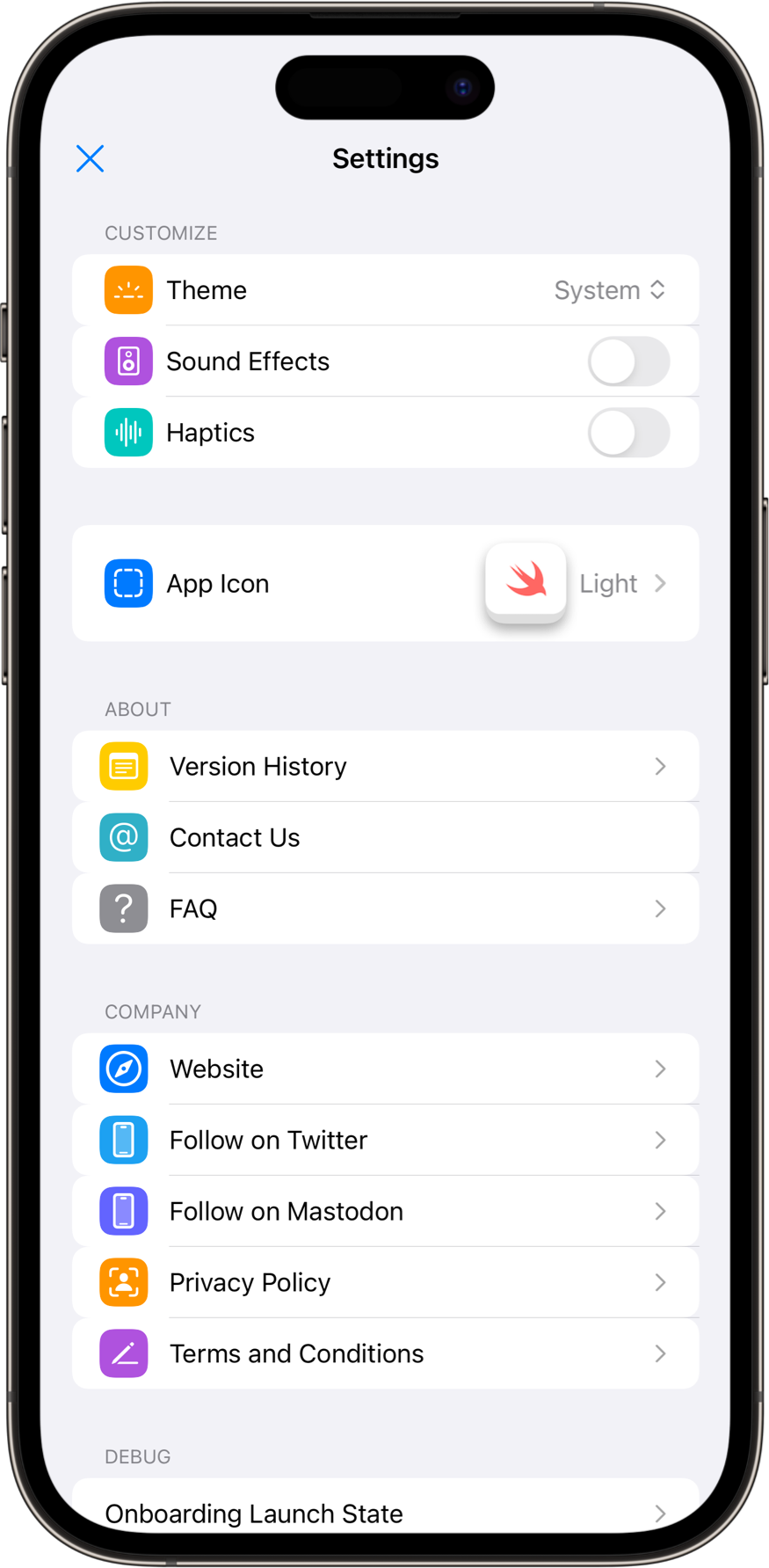
SwiftUI Settings View
A SwiftUI View that lists user settings and app specific preferences. Provides a consolidated space for application experience customization, user account and subscription management.
Also includes a section for adding bespoke development tools usable in debug builds.
Usage
SettingsList(
    interactor: .init(didSelectDone: {})
)
Features
- App icon customization.
- Color theme customization (override system light/dark mode settings).
- Turn on/off application haptic feedback.
- Turn on/off application sound effects
- Expose information about your company to users, including: FAQs, contact email (in-app mail composition is supported), website, social URL’s, privacy policy, terms + conditions.
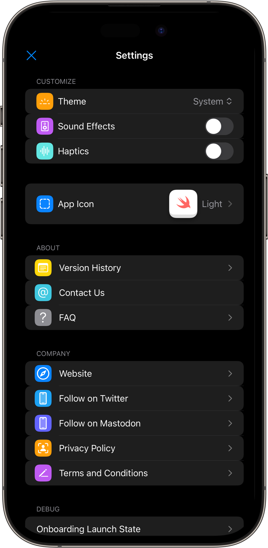
- Supports light and dark device color schemes by default.
- Supports font scaling via Dynamic Type.
- Supports offline usage in SwiftUI Previews for easy debugging and testing.
