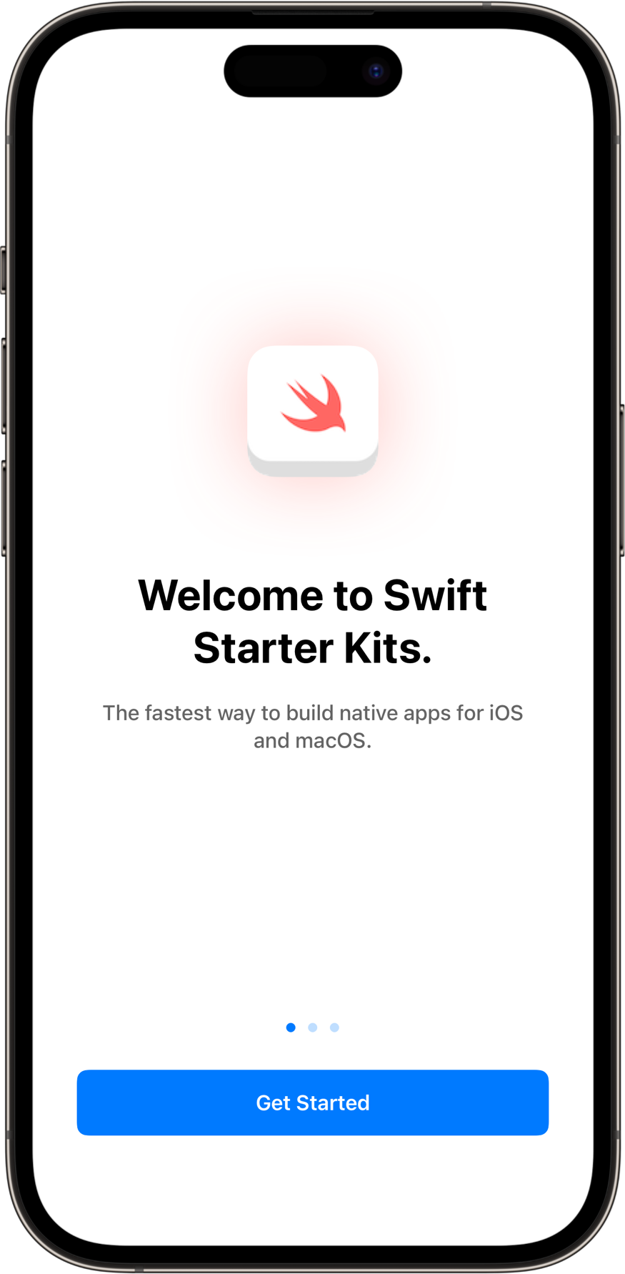
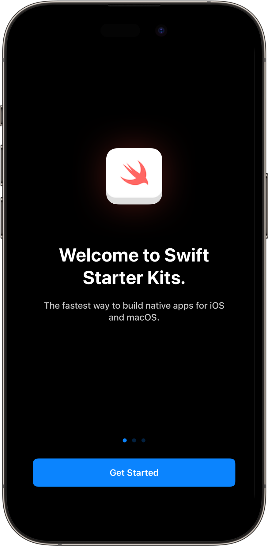
SwiftUI Onboarding View
A SwiftUI View for guiding a user through their first time in-app journey. Introduce your apps features, talk about how your app solves their problem. Ideally used only upon first app launch as a dismissable modal or sheet to minimize friction.
Usage
OnboardingView(
    interactor: .init(didSelectGetStarted: {})
)
Features
- Create customizable single slides through
OnboardingSlide.OnboardingViewuses an array of slide’s to dynamically create a contained scrollable paging view. - Supports light and dark device color schemes by default.
- Supports font scaling via Dynamic Type.
- Supports offline usage in SwiftUI Previews for easy debugging and testing.
