SwiftUI Text
Published on April 15, 2024
Creating usable software is a problem in conveying information. We write our programs to be used by people, and people need to understand the intended flow of the software in question.
The key word here is intent. What are our programs intending to do? Look past the glitz and the glam, the beautifully designed interfaces that are typical in modern software (usability aside). In the end, it’s all just text. All past, present and future software boils down to text.
SwiftUI Text provides a simple yet effective way to render text on Apple platforms, with a myriad of configuration options that provide powerful opportunities for composition.
Rendering and Styling
At its most basic, Text is a SwiftUI view structure that renders read-only text:
Text("Let's go Yankees.")
Just like the rest of SwiftUI, customizing and styling Text happens declaratively, focusing on the what, rather than the how:
Text("Let's go Yankees.")
    .font(.system(.largeTitle))
    .italic()
The .italic() and .font(_ font: Font?) functions are modifiers made present through an extension of SwiftUI Text. Both of these functions refer to the current Text value, apply the transformation, and return a new Text value. Modifications can be chained together to achieve more advanced styling compositions:
Text("Let's go Yankees.")
    .font(.system(.largeTitle))
    .bold()
    .padding()
    .background(
        Color(red: 28/255, green: 40/255, blue: 65/255)
    )
    .foregroundStyle(.white)
    .clipShape(RoundedRectangle(cornerRadius: 8))
Font Configuration
There are a dedicated set of options for customizing font’s in SwiftUI. We can change the font family, the font’s weight, the design of the current font, and the width between characters of the font.
.font
We can customize text’s font by using the .font(_ font: Font?) function. This sets the default font for the given view. This can be a custom font of your own choosing, or one of the many semantic FontStyle options provided by the system:
VStack {
    Text("Let's go Yankees.").font(.largeTitle)
    Text("Let's go Yankees.").font(.title)
    Text("Let's go Yankees.").font(.title2)
    Text("Let's go Yankees.").font(.title3)
    Text("Let's go Yankees.").font(.headline)
    Text("Let's go Yankees.").font(.subheadline)
    Text("Let's go Yankees.").font(.body)
    Text("Let's go Yankees.").font(.callout)
    Text("Let's go Yankees.").font(.footnote)
    Text("Let's go Yankees.").font(.caption)
    Text("Let's go Yankees.").font(.caption2)
}
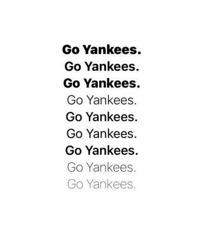
.fontWeight
Using the .fontWeight(_ weight: Font.Weight?) function, we can customize the weight of the current Text view using a Font.Weight. Font.Weight is a dedicated enum that provides an enumeration of semantic weight options. These are tools for adding emphasis to our static text:
VStack {
    Text("Let's go Yankees.").fontWeight(.black)
    Text("Let's go Yankees.").fontWeight(.bold)
    Text("Let's go Yankees.").fontWeight(.heavy)
    Text("Let's go Yankees.").fontWeight(.light)
    Text("Let's go Yankees.").fontWeight(.medium)
    Text("Let's go Yankees.").fontWeight(.regular)
    Text("Let's go Yankees.").fontWeight(.semibold)
    Text("Let's go Yankees.").fontWeight(.thin)
    Text("Let's go Yankees.").fontWeight(.ultraLight)
}
.fontDesign
We can customize the design of a font using the .fontDesign(_ design: Font.Design?) function. Without getting deep into the weeds of typography, Font.Design is an enum that provides multiple options for changing the active typeface:
VStack {
    Text("Let's go Yankees.").fontDesign(.default)
    Text("Let's go Yankees.").fontDesign(.serif)
    Text("Let's go Yankees.").fontDesign(.rounded)
    Text("Let's go Yankees.").fontDesign(.monospaced)
}.font(.largeTitle)
.fontWidth
This function configures the width of characters within the Text view. Here’s an example of the various width options for the default system font:
VStack {
    Text("Let's go Yankees").fontWidth(.compressed)
    Text("Let's go Yankees").fontWidth(.condensed)
    Text("Let's go Yankees").fontWidth(.standard)
    Text("Let's go Yankees").fontWidth(.expanded)
}.font(.largeTitle)
It’s important to note that these values will only work on fonts that support multiple width rendering options.
Formatting
We frequently want control over how our text renders given varied string lengths and legibility intentions. SwiftUI provides text formatting functions for specifying text alignment, truncation, line spacing and line limits.
Multiline Text Alignment
A Text view that spans multiple lines will by default align to the leading side of the text. This can be customized to align to the leading edge, trailing edge, or in the center:
let text = "The opening day lineup for the New York Yankees: 1. Gleyber Torres, 2B, 2. Juan Soto, RF 3. Aaron Judge, CF 4. Giancarlo Stanton, DH 5. Anthony Rizzo, 1B 6. Anthony Volpe, SS 7. Alex Verdugo, LF 8. Jose Trevino, C 9. Oswaldo Cabrera, 3B."

VStack(spacing: 20) {
    Text(text).multilineTextAlignment(.leading)
    Text(text).multilineTextAlignment(.center)
    Text(text).multilineTextAlignment(.trailing)
}
.frame(width: 300)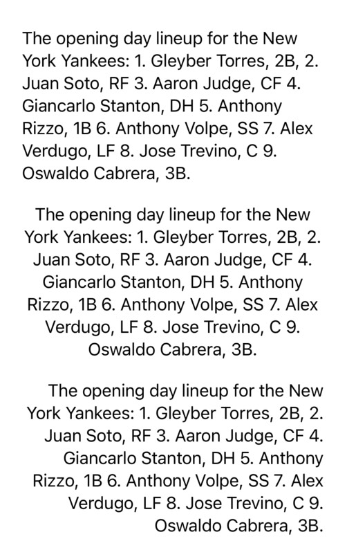
Line Limits
By default, Text’s size will expand to fit it’s contents within its contextual bounds. Text is expanded into new lines as string length increases, or when the font size grows. Typically we want to keep our interface accessible by supporting custom font scaling – meaning we may need to support an infinite number of layout options.
Sometimes though, we just want to cap the text at a specific number of lines. .lineLimit(_ number: Int?) allows us to customize this:
let text = "The opening day lineup for the New York Yankees: 1. Gleyber Torres, 2B, 2. Juan Soto, RF 3. Aaron Judge, CF 4. Giancarlo Stanton, DH 5. Anthony Rizzo, 1B 6. Anthony Volpe, SS 7. Alex Verdugo, LF 8. Jose Trevino, C 9. Oswaldo Cabrera, 3B."

VStack(spacing: 20) {
    Group {
        Text(text).lineLimit(1)
        Text(text).lineLimit(2)
        Text(text).lineLimit(3)
    }
    .padding()
    .background(.blue)
    .foregroundStyle(.white)
}
.padding(.horizontal, 24)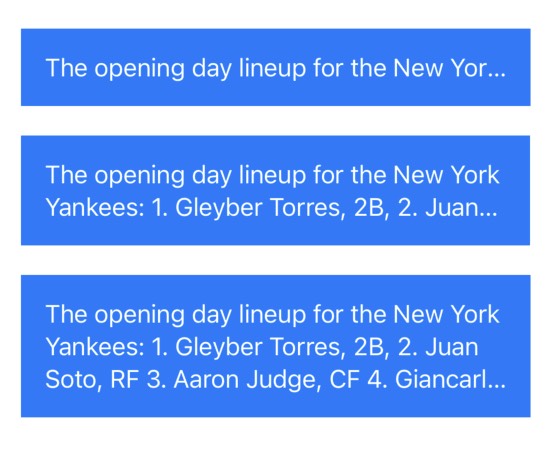
Line Spacing
In a multi-line text context, we can change the spacing between lines of text using the .lineSpacing(_ lineSpacing: CGFloat) function. The spacing value given is used to provide a consistent distance between each new line of text:
let text = "The opening day lineup for the New York Yankees: 1. Gleyber Torres, 2B, 2. Juan Soto, RF 3. Aaron Judge, CF 4. Giancarlo Stanton, DH 5. Anthony Rizzo, 1B 6. Anthony Volpe, SS 7. Alex Verdugo, LF 8. Jose Trevino, C 9. Oswaldo Cabrera, 3B."

VStack(spacing: 20) {
    Group {
        Text(text).lineSpacing(0)
        Text(text).lineSpacing(10)
        Text(text).lineSpacing(20)
        Text(text).lineSpacing(30)
    }
    .padding()
    .background(.blue)
    .foregroundStyle(.white)
    .lineLimit(3)
}
.padding(.horizontal, 24)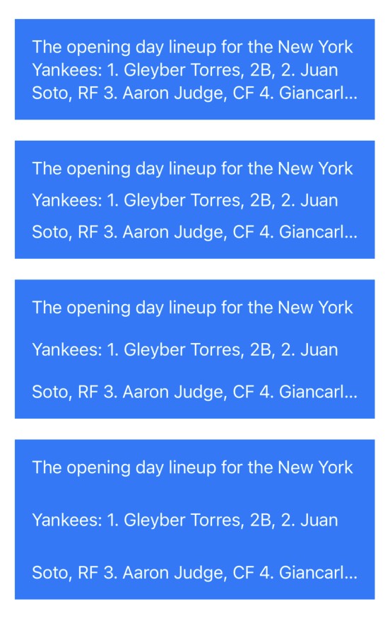
Text Truncation
Text that has been truncated due to having a lineLimit set will truncate at the tail end of the text by default. The behavior of truncation can be customized:
let text = "The opening day lineup for the New York Yankees: 1. Gleyber Torres, 2B, 2. Juan Soto, RF 3. Aaron Judge, CF 4. Giancarlo Stanton, DH 5. Anthony Rizzo, 1B 6. Anthony Volpe, SS 7. Alex Verdugo, LF 8. Jose Trevino, C 9. Oswaldo Cabrera, 3B."

VStack(spacing: 20) {
    Group {
        Text(text).truncationMode(.head)
        Text(text).truncationMode(.middle)
        Text(text).truncationMode(.tail)
    }
    .lineLimit(1)
}
.frame(width: 300)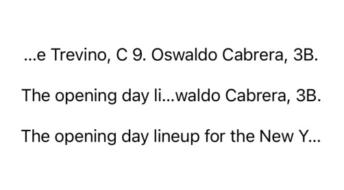
The head, middle and tail are the enum cases for Text.TruncationMode. As can be seen above, these options change where the text truncates (denoted by the changing placement of the ellipses).
Localization
Eventually, we want to make our apps usable in multiple languages and locales. After all, why wouldn’t we want our software to be usable by the widest demographic possible?
SwiftUI Text has built in functionality for String localization, which we’ve secretly been accessing this entire time. Unless instructed otherwise, a String literal passed to Text is treated as a LocalizedStringKey. The following examples are conceptually the same:
// a string literal,
Text("Let's go Yankees.")

// is treated as a LocalizedStringKey by default.
Text(LocalizedStringKey("Let's go Yankees."))
LocalizedStringKey is a SwiftUI native version of NSLocalizedString (albeit, without many of the bells and whistles). When Text is being rendered it first attempts to lookup a matching string key in the bundles Localizable.strings file for the active Locale. If none is found, the string will be rendered as-is.
This also means that a string passed to the Text initializer can be thought of as merely a dictionary key. In practice, it’s good programming style to separate user facing copy from code. Once it becomes time to support multiple languages, we simply need to provide a dedicated Localizable.strings file for a new Locale, the system will take care of the rest.
Thinking about user-facing copy as context specific keys will also help isolate our text changes over time, creating a clean separation of concerns. For example, rather than:
Text("Enter a user name and password to create an account")Our call-site can instead become:
Text("signup.header")And we can migrate the actual string value to a Localizable.strings file:
"signup.header" = "Enter a user name and password to create an account";The copy presented to the user will depend on whether we have a Localizable.strings file that matches the systems locale. If none exists, the system will fallback to the base localization (in this case, English – “en”).
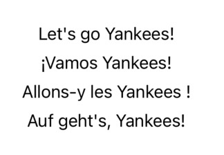
In a SwiftUI Preview, we can override the environment locale value to see this in action:
VStack(spacing: 8) {
    Text("go.yankees")
        .environment(\.locale, .init(identifier: "en"))
    Text("go.yankees")
        .environment(\.locale, .init(identifier: "es"))
    Text("go.yankees")
        .environment(\.locale, .init(identifier: "fr"))
    Text("go.yankees")
        .environment(\.locale, .init(identifier: "de"))
}
Note: In Xcode 15, Apple introduced String Catalogues. Moving forward, this is the recommended way to localize copy.
Properly internationalizing your app is a much larger topic that we’re only scratching the surface of. For further learning about localization, the Apple Developer Docs has a great guide on the subject.
Accessibility
Software accessibility is crucial because it ensures that all users, including those with disabilities, have an equal opportunity to use our app. For example, blind users will typically be traversing an app using VoiceOver to get a audio representation of a user interface.
SwiftUI provides a ton of accessibility functionality for free, but it’s good practice to provide extra information to the system where possible. SwiftUI Text has several dedicated accessibility tools.
AccessibilityLabel
Sometimes, we need to provide just a little bit more information about the purpose of a component. The most common tool for such an occasion is appending an accessibilityLabel:
Text("☎️")
    .accessibilityLabel("Phone Number")
By default, VoiceOver will read allowed the contents of a Text view, but sometimes the contents does not accurately represent the intent. accessibilityLabel allows us to provide an alternative description to the VoiceOver system. The value passed to accessibilityLabel() can be either a String, a Text value (styling will not be applied), or a LocalizedStringKey.
AccessibilityHeading
The structural layout of text can provide important visual
information about the hierarchy in a given document. If this structure
is important to the contents, it’s worth surfacing to the system by
specifying a accessibilityHeading:
Text("The History of the New York Yankees")
    .accessibilityHeading(.h1)
The .accessibilityHeading function takes a AccessibilityHeadingLevel, which is an enum that exposes a hierarchy of headings. When applying a heading level to a given Text value, you’re describing the hierarchy in relation to the other headings provided by the view.
AccessibilityHeadingLevel supports the following heading values:
case unspecified
case h1
case h2
case h3
case h4
case h5
case h6
AccessibilityTextContentType
VoiceOver can be configured to vary how the contents of a Text view is read allowed, depending on it’s contextual type. For example, what we have a little snippet of source code? Punctuation characters convey a very different meaning in code when compared to prose:
Text("Text(\"Hello world\")")
    .accessibilityTextContentType(.sourceCode)
Here, we provided .sourceCode value of AccessibilityTextContentType. When read allowed, VoiceOver will speak the open and closed parenthesis in this example, ensuring that the syntax can be correctly conveyed.
AccessibilityTextContentType is a system structure with no available initializers, and is used as a namespace to provide eight static values:
/// A type that represents generic text that has no specific type.
public static let plain: AccessibilityTextContentType

/// A type that represents text used for input, like in the Terminal app.
public static let console: AccessibilityTextContentType

/// A type that represents text used by a file browser, like in the Finder app in macOS.
public static let fileSystem: AccessibilityTextContentType

/// A type that represents text used in a message, like in the Messages app.
public static let messaging: AccessibilityTextContentType

/// A type that represents text used in a story or poem, like in the Books app.
public static let narrative: AccessibilityTextContentType

/// A type that represents text used in source code, like in Swift Playgrounds.
public static let sourceCode: AccessibilityTextContentType

/// A type that represents text used in a grid of data, like in the Numbers app.
public static let spreadsheet: AccessibilityTextContentType

/// A type that represents text used in a document, like in the Pages app.
public static let wordProcessing: AccessibilityTextContentType