SwiftUI Stack Views
Published on April 22, 2024
The history of the stack view on iOS is an interesting one. UIStackView wasn’t a part of UIKit until iOS 9 in 2015 – a full 7 years after the introduction of the App Store. The iOS community, being a pragmatic bunch, ensured that open-source alternatives existed long before we had a first-party solution.
We take it for granted now, but there was a time that laying out views sequentially was something that we did manually in the worst case, or with an ad-hoc abstraction in the best case. In hindsite, it’s such a blatantly useful concept – offloading sequential view layout to a dedicated tool.
Flash forward to SwiftUI’s release in 2019 alongside iOS 13, and we’re given a host of stack layout tools right off the bat. A tool originally born out of necessity is now a cornerstone of SwiftUI view layout.
What is a Stack view, anyway?
When building graphical layouts, we think in three dimensions. Where does a visual element exist horizontally, vertically, and what is it’s depth? Applied to the Cartesian coordinate system, these are our X, Y and Z axis’.
In SwiftUI, we want to think about our layouts declaratively, focusing more on the what rather than how. Where we used to give explicit coordinates for our views (or semantic coordinates, in the case of layout constraints), we now typically group views in relation to eachother.
We have several dedicated tools for this in SwiftUI:
- VStack, to group view’s together vertically.
- HStack, to group view’s together horizontally.
- ZStack, to group view’s together by depth.
Let’s look at each of these in turn.
VStack
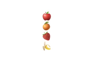
When we want to group our view’s vertically along the y axis, let’s reach for a VStack:
VStack {
    Text("🍎")
    Text("🍊")
    Text("🍓")
    Text("🍌")
}
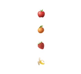
If we’d like to change the distance between subviews, we can set spacing initializer value.
VStack(spacing: 20) {
    Text("🍎")
    Text("🍊")
    Text("🍓")
    Text("🍌")
}
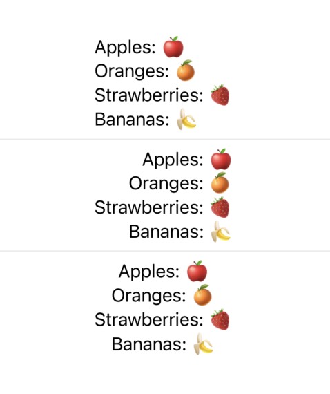
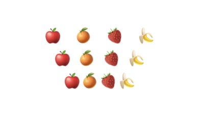
Aligning subviews to the leading, center, or trailing edge can be done using the alignment initializer value. By default, alignment is centered.
VStack(spacing: 8) {
    VStack(alignment: .leading) {
        Text("Apples: 🍎")
        Text("Oranges: 🍊")
        Text("Strawberries: 🍓")
        Text("Bananas: 🍌")
    }
    Divider()
    VStack(alignment: .trailing) {
        Text("Apples: 🍎")
        Text("Oranges: 🍊")
        Text("Strawberries: 🍓")
        Text("Bananas: 🍌")
    }
    Divider()
    VStack(alignment: .center) {
        Text("Apples: 🍎")
        Text("Oranges: 🍊")
        Text("Strawberries: 🍓")
        Text("Bananas: 🍌")
    }
}
These alignment values are static constants of the HorizontalAlignment struct:
extension HorizontalAlignment {
    static let leading: HorizontalAlignment
    static let trailing: HorizontalAlignment
    static let center: HorizontalAlignment
}
HStack
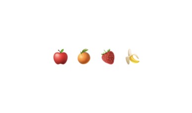
HStack, VStack’s x-axis sibling, composes views horizontally:
HStack {
    Text("🍎")
    Text("🍊")
    Text("🍓")
    Text("🍌")
}
HStack also boasts the same initialization options as it’s vertical counterpart, allowing for uniform subview spacing:
VStack(spacing: 8) {
    HStack(spacing: 16) {
        Text("🍎")
        Text("🍊")
        Text("🍓")
        Text("🍌")
    }
    HStack(spacing: 8) {
        Text("🍎")
        Text("🍊")
        Text("🍓")
        Text("🍌")
    }
    HStack(spacing: 0) {
        Text("🍎")
        Text("🍊")
        Text("🍓")
        Text("🍌")
    }
}
In this example, we also touch on another capability of SwiftUI’s Stack view’s – they can be composed together! This helps create consistently spaced layouts using both vertical and horizontally grouped subviews.
Lastly, HStack subviews can also be explicitly aligned using the alignment initializer value. The one difference from a VStack though, is that a horizontal stack view defines its vertical alignment of the container:
HStack() {
    VStack {
        Text("Top").font(.headline)
        ZStack(alignment: .top) {
            HStack(alignment: .top) {
                Image(systemName: "paperplane")
                    .font(.system(size: 50))
                Image(systemName: "paperplane")
                    .font(.system(size: 25))
                Image(systemName: "paperplane")
                    .font(.system(size: 10))
            }
            Divider().frame(height: 2).background(.red)
        }
        .background(.black.opacity(0.05))
    }

    VStack {
        Text("Center").font(.headline)
        ZStack(alignment: .center) {
            HStack(alignment: .center) {
                Image(systemName: "paperplane")
                    .font(.system(size: 50))
                Image(systemName: "paperplane")
                    .font(.system(size: 25))
                Image(systemName: "paperplane")
                    .font(.system(size: 10))
            }
            Divider().frame(height: 2).background(.red)
        }
        .background(.black.opacity(0.05))
    }

    VStack {
        Text("Bottom").font(.headline)
        ZStack(alignment: .bottom) {
            HStack(alignment: .bottom) {
                Image(systemName: "paperplane")
                    .font(.system(size: 50))
                Image(systemName: "paperplane")
                    .font(.system(size: 25))
                Image(systemName: "paperplane")
                    .font(.system(size: 10))
            }
            Divider().frame(height: 2).background(.red)
        }
        .background(.black.opacity(0.05))
    }
}
.padding(.horizontal)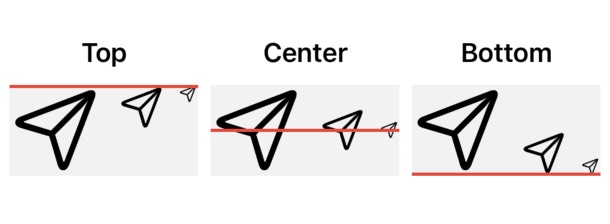
A ZStack is used here to help illustrate how HStack alignment effects a container’s subviews vertically. You can see this in action by changing the sizes of horizontally stacked subviews, then watching how they align to the defined vertical edge.
HStack container alignment requires a VerticalAlignment. There are several alignment presets that come built-in:
extension VerticalAlignment {
    public static let top: VerticalAlignment
    public static let center: VerticalAlignment
    public static let bottom: VerticalAlignment
    public static let firstTextBaseline: VerticalAlignment
    public static let lastTextBaseline: VerticalAlignment
}
ZStack
ZStack is a stack view that affects the depth of subviews in relation to each other. Subviews initialized first are rendered underneath subviews initialized after. Effectively, this causes views to overlay one another:
func randomColor() -> UIColor {
    return UIColor(
        red: CGFloat.random(in: 0...255)/255,
        green: CGFloat.random(in: 0...255)/255,
        blue: CGFloat.random(in: 0...255)/255,
        alpha: 1.0
    )
}

ZStack(alignment: .topLeading) {
    ForEach(0...10, id: \.self) { index in
        Color(uiColor: randomColor())
            .frame(width: 100, height: 100)
            .padding(.leading, CGFloat(index * 10))
            .padding(.top, CGFloat(index * 10))
    }
}
.padding(16)
.background(.black.opacity(0.05))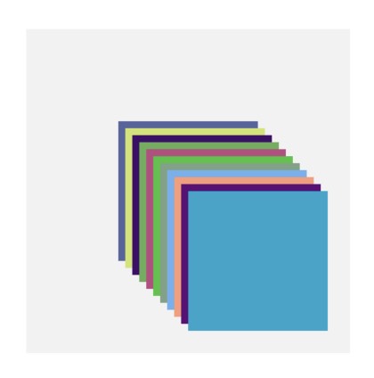
Given that a ZStack doesn’t render subviews on a single 2-dimensional plane, there isn’t a concept of “spacing” items like the vertical and horizontal stack view counterparts. Setting a ZStack’s alignment however, requires specifying how the container aligns subviews both vertically and horizontally:
func StackedColors(_ alignment: Alignment, _ title: String) -> some View {
    VStack {
        ZStack(alignment: alignment) {
            let multiplier = 4
            ForEach(0...10, id: \.self) { index in
                Color(uiColor: randomColor())
                    .frame(width: 40, height: 40)
                    .padding(.leading, CGFloat(index * multiplier))
                    .padding(.top, CGFloat(index * multiplier))
            }
        }
        .border(.black, width: 1)
        .frame(maxWidth: .infinity)
        .padding()

        Text(title)
            .padding(.bottom, 4)
    }
    .background(.black.opacity(0.05))
}

VStack {
    HStack {
        StackedColors(.topLeading, ".topLeading")
        StackedColors(.top, ".top")
        StackedColors(.topTrailing, ".topTrailing")
    }

    HStack {
        StackedColors(.leading, ".leading")
        StackedColors(.center, ".center")
        StackedColors(.trailing, ".trailing")
    }

    HStack {
        StackedColors(.bottomLeading, ".bottomLeading")
        StackedColors(.bottom, ".bottom")
        StackedColors(.bottomTrailing, ".bottomTrailing")
    }
}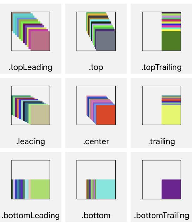
Seen here, we’ve put together all of our stack layout tools to visualize how ZStack’s handle various alignments.
Lazily Loaded Stacks
VStack and HStack have two cousins: LazyVStack, and LazyHStack. Both of these are functionally the same as their counterparts, with one exception: subview’s are loaded lazily.
Lazy loading is useful when we have subviews within the stack container that aren’t currently visible on screen – where it doesn’t make sense to render them at their initialization.
