SwiftUI NavigationStack
Published on May 6, 2024
In iOS 16, a new component called NavigationStack was added to SwiftUI for handling multi-screen flow navigation. NavigationView, the previous solution to this problem, has been deprecated.
NavigationStack adds some much needed flexibility by providing multiple state management solutions, perfect for those times when we want to construct our navigation state programmatically.
Lets look at what NavigationStack has to offer.
Initializers
The documentation specifies that there are two ways to initialize a NavigationStack, the first with a Root view:
NavigationStack(root: {
    ZStack {
        Rectangle().fill(Color.yellow)

        NavigationLink("Next") {
            Rectangle().fill(Color.orange)
        }
    }
})Here’s the initializer definition:
@MainActor
init(@ViewBuilder root: () -> Root) where Data == NavigationPath
Root is a generic type constraint, denoting a View that semantically acts as the “root” of the NavigationStack. We can see this specification alongside the definition of NavigationStack itself:
@available(iOS 16.0, macOS 13.0, tvOS 16.0, watchOS 9.0, *)
@MainActor public struct NavigationStack<Data, Root> : View where Root : View { /* interface */}
The other bit of interest here is the definition of
Data, another generic type constraint on
NavigationStack. Data is referring to the type of
state that drives the navigation stack. In our original example, we
get a hint about what type Data can actually be set to,
since we don’t seem to ever set it directly: where Data == NavigationPath.
Ah, there it is, Data needs to be a
NavigationPath.
The second NavigationStack initializer gives another hint about NavigationPath’s purpose:
@MainActor
init(
    path: Binding<NavigationPath>,
    @ViewBuilder root: () -> Root
) where Data == NavigationPath
Rather than providing only a @ViewBuilder root: () -> Root
closure to construct a root view, we’re also asked to provide a path: Binding<NavigationPath>.
Putting these two tools together, we can describe a navigation hierarchy
that reacts to any data value, allowing us to drive a
navigation stack with laughable ease.
Lets see this in action with a larger example:
extension Color {

    private static var randomValue: Double {
        let value = (0...255).randomElement() ?? 0
        return Double(value)/255.0
    }

    static func random() -> Color {
        Color(
            red: randomValue,
            green: randomValue,
            blue: randomValue
        )
    }
}

struct ColorView: View {

    var color: Color
    var didSelectPush: () -> Void
    var didSelectPop: () -> Void
    var didSelectRemoveAll: () -> Void

    init(
        color: Color,
        didSelectPush: @escaping () -> Void,
        didSelectPop: @escaping () -> Void,
        didSelectRemoveAll: @escaping () -> Void) {
            self.color = color
            self.didSelectPush = didSelectPush
            self.didSelectPop = didSelectPop
            self.didSelectRemoveAll = didSelectRemoveAll
    }

    var body: some View {
        ZStack {
            color

            VStack {
                Button("Push", action: didSelectPush)
                Button("Pop", action: didSelectPop)
                Button("Remove All", action: didSelectRemoveAll)
            }
            .buttonStyle(.borderedProminent)
        }
        .ignoresSafeArea(edges: .bottom)
        .navigationBarTitleDisplayMode(.inline)
        .navigationBarTitle("Color: \(color.description)")
    }
}

struct NavigationContainer: View {

    @State private var path: [Color] = []

    var body: some View {
        NavigationStack(path: $path, root: {
            SharedView(color: Color.random())
                .navigationDestination(for: Color.self, destination: { color in
                    SharedView(color: color)
                })
        })
    }

    private func SharedView(color: Color) -> some View {
        ColorView(
            color: color,
            didSelectPush: {
                path.append(Color.random())
            },
            didSelectPop: {
                _ = path.popLast()
            },
            didSelectRemoveAll: {
                path.removeAll()
            })
    }
}
Here we’re expanding upon our original example quite a bit. Rather than creating a single navigation hierarchy that displays two hard coded colors, we’re now creating a recursive hierarchy that displays randomly generated colors. Colors are pushed onto the stack infinitely, then popped off the stack until we return to our root.
Here’s how this looks in practice:
Shrinking the above code block down to the essentials, I’d like to emphasize how little work is required to achieve a functioning navigation hierarchy:
@State private var path: [Color] = []

var body: some View {
    NavigationStack(path: $path, root: {
        SharedView(color: Color.random())
            .navigationDestination(for: Color.self, destination: { color in
                SharedView(color: color)
            })
    })
}
Just look at that! Ignoring for a moment the other ~50 lines of abstraction to product something that looks marginally elegant, SwiftUI strips away all the ceremony and leaves us with nothing but state and a couple of view wrappers.
With our color path set up, pushing a new view onto the
stack is as simple as appending to the array:
path.append(Color.random())Removing the top-most view merely requires removing the last element of the array:
_ = path.popLast()And to return to the root of our view, we remove all elements of the array:
path.removeAll()Ain’t that something?
But there’s more. What happens to our path array when a user manually selects
the back button? Doesn’t it fall out of sync since we aren’t updating
our state array?
Nope! Since we passed a binding for the path when the
NavigationStack was initialized, its state is kept in
sync as it reacts to user input.
Customizing the Navigation Bar
With the basic mechanics of NavigationStack in place, how might we customize its look and feel?
Out of the box, NavigationStack gives us all the essentials: a device specific visual style and a set of interactions native to the operating system. The defaults are an ideal starting point, but we also have the ability to customize some aspects of a NavigationStack:
- Adding a title to the navigation bar.
- Changing the display mode of the navigation bar.
- Changing the navigation bar’s background color.
- Changing the navigation bar’s title color scheme.
Lets look at each of these in turn.
Navigation Bar Title
Commonly, we want to provide a title for the current screen to give a
user context to the purpose of the interface. When using a
NavigationStack, we have built in support for applying
a title by using the .navigationTitle(_ titleKey:)
view extension:
NavigationStack {
    ScrollView {
        VStack {
            ForEach(0...10, id: \.self, content: { index in
                RoundedRectangle(cornerRadius: 8)
                    .fill(.blue.opacity(0.05))
                    .frame(height: 140)
            })
        }
        .padding(.horizontal)
    }
    .ignoresSafeArea(edges: [.bottom])
    .navigationTitle("Create Account") // 👈 Setting the title
}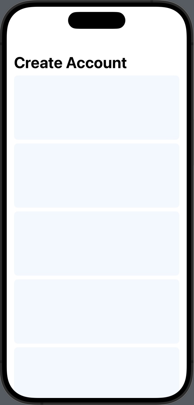
It’s important to note that navigationTitle(_ titleKey:)
isn’t set on the NavigationStack itself, but instead on
its sub-views. This is a common error that will silently fail in
practice.
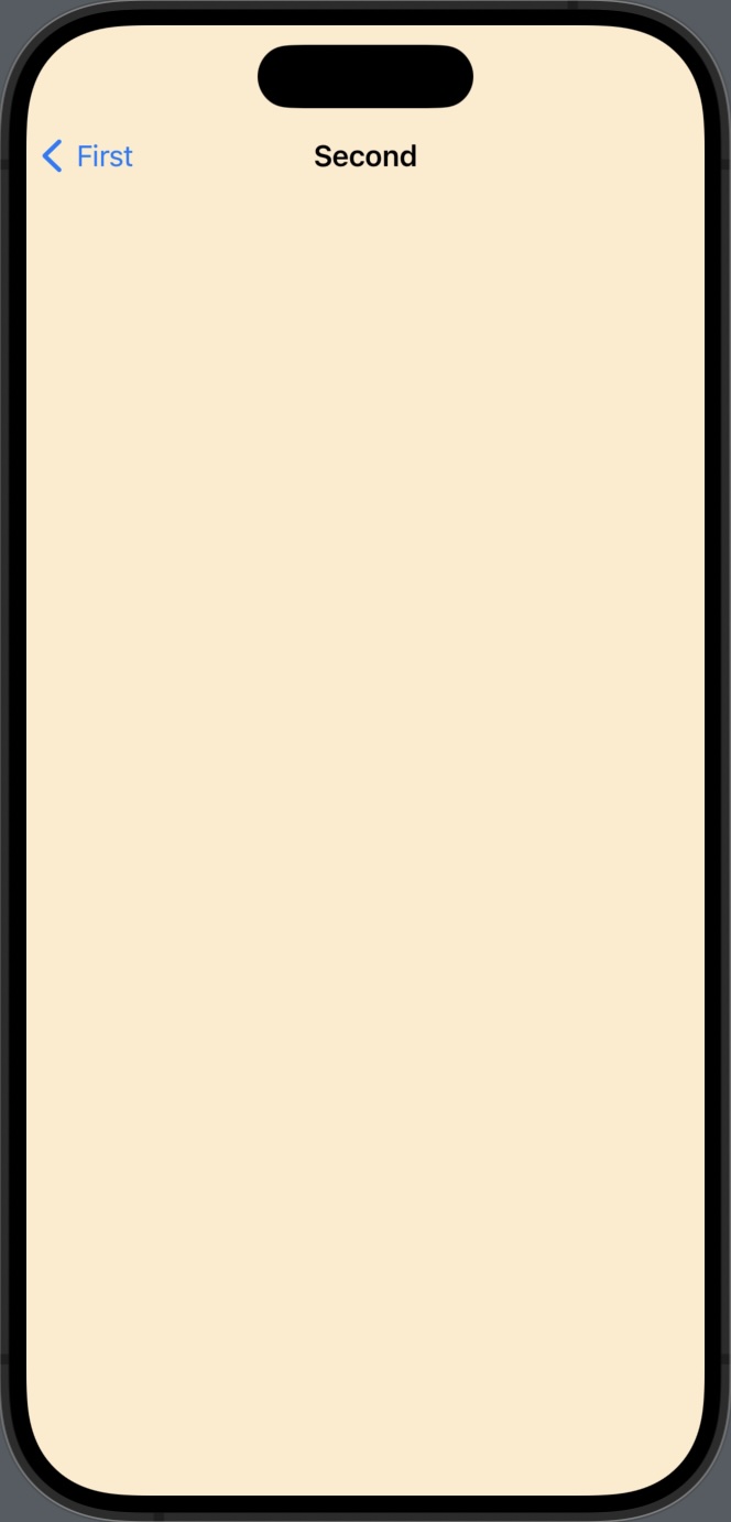
The navigation bar automatically handles the transition between titles in a stack, including the back buttons state:
NavigationStack {
    ZStack {
        Rectangle()
            .fill(.blue.opacity(0.2))

        NavigationLink("Next") {
            Rectangle()
                .fill(Color.orange.opacity(0.2))
                .ignoresSafeArea()
                .navigationTitle("Second") // 👈 Second screen's title
        }
    }
    .ignoresSafeArea()
    .navigationTitle("First") // 👈 First screen's title
}
Navigation Bar Display Mode
The display mode of a navigation bar can be set using the .navigationBarTitleDisplayMode(_ displayMode:)
view extension. This function expects a display mode of type NavigationBarItem.TitleDisplayMode,
which is an enum with 3 options:
public enum TitleDisplayMode: Sendable {
case automatic
case inline
case large
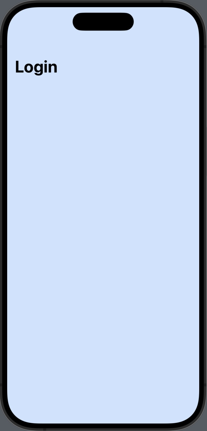
}Setting the display mode to large will expand the navigation bar into a larger state:
NavigationStack {
    Rectangle()
        .fill(.blue.opacity(0.2))
        .ignoresSafeArea()
        .navigationTitle("Login")
        .navigationBarTitleDisplayMode(.large) // 👈 Large display mode
}
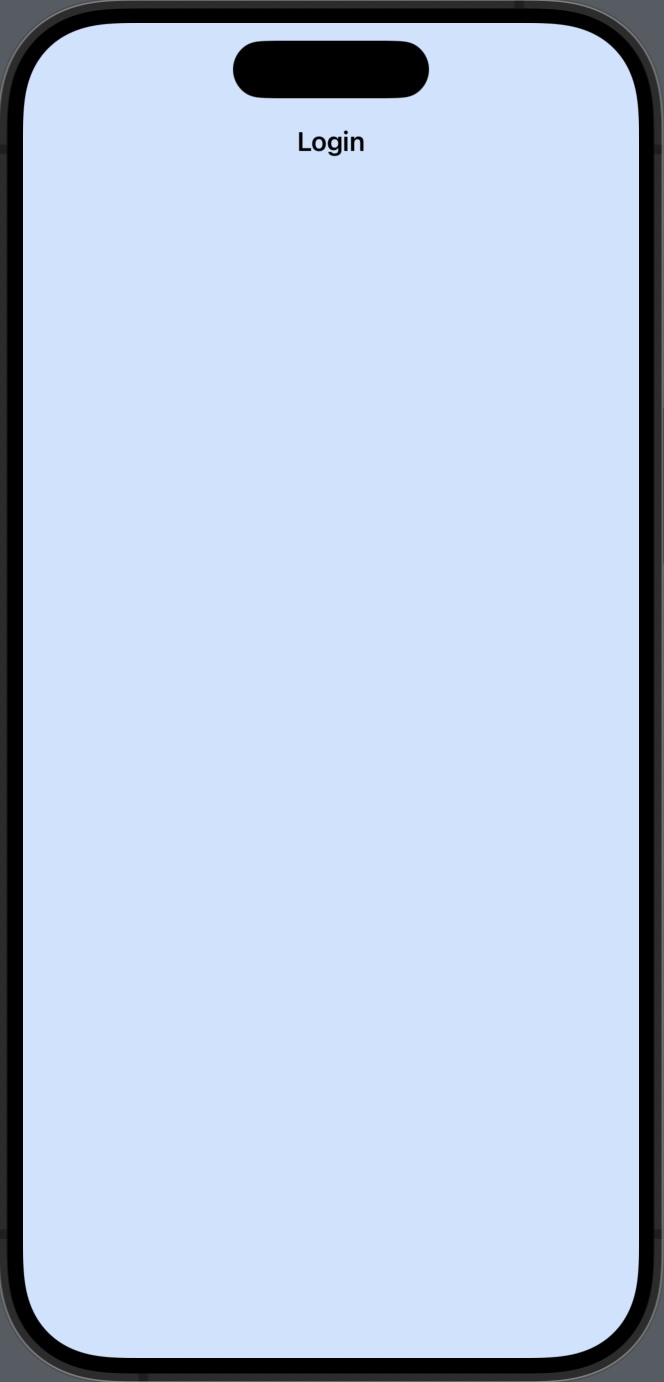
An inline display mode will put the navigation bar into the standard iOS navigation title state:
NavigationStack {
    Rectangle()
        .fill(.blue.opacity(0.2))
        .ignoresSafeArea()
        .navigationTitle("Login")
        .navigationBarTitleDisplayMode(.inline) // 👈 Inline display mode
}
An automatic display mode will inherit its value from the previous view on the stack:
NavigationStack {
    ZStack {
        Rectangle()
            .fill(.blue.opacity(0.2))

        NavigationLink("Next") {
            Rectangle()
                .fill(Color.orange.opacity(0.2))
                .ignoresSafeArea()
                .navigationTitle("Second")
                // 👇 automatic display mode
                .navigationBarTitleDisplayMode(.automatic)
        }
    }
    .ignoresSafeArea()
    .navigationTitle("First")
    // 👇 inline display mode, inherited by subviews
    .navigationBarTitleDisplayMode(.inline)
}
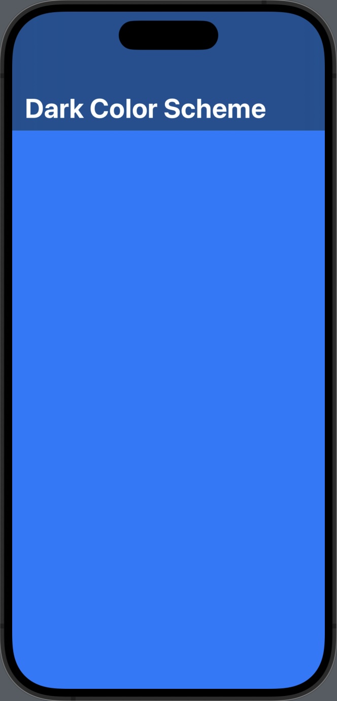
Navigation Bar Title Color Scheme
As of iOS 17, there still isn’t a SwiftUI native way to change the text color of a navigation bar (we still need to dip down into UIKit to do this). However, we do have control over setting the color scheme, specifying between light and dark variants.
Customizing the bar’s color scheme only takes effect if the toolbar
background is set to visible. This can be done using the .toolbarBackground()
and .toolbarColorScheme()
view extensions, respectively:
NavigationStack {
    Rectangle()
        .fill(.blue)
        .ignoresSafeArea()
        .navigationTitle("Dark Color Scheme")
        .toolbarBackground(.visible, for: .navigationBar)
        .toolbarColorScheme(.dark, for: .navigationBar)
        // 👆 the background must be set to "visible"
        //    for color scheme to take effect
}
Navigation Bar Background Color
Similar to specifying a text color scheme, setting the background
color of a navigation bar in SwiftUI requires a combination of calls to
toolbarBackground(),
one to ensure the background is set to .visible, then
another to set the color:
NavigationStack {
    Rectangle()
        .fill(.pink.opacity(0.20))
        .ignoresSafeArea()
        .navigationTitle("Custom Color")
        .toolbarBackground(.visible, for: .navigationBar)
        .toolbarBackground(.pink, for: .navigationBar)
        // 👆 ".visible" is required for the color to take effect
        .toolbarColorScheme(.dark, for: .navigationBar)
}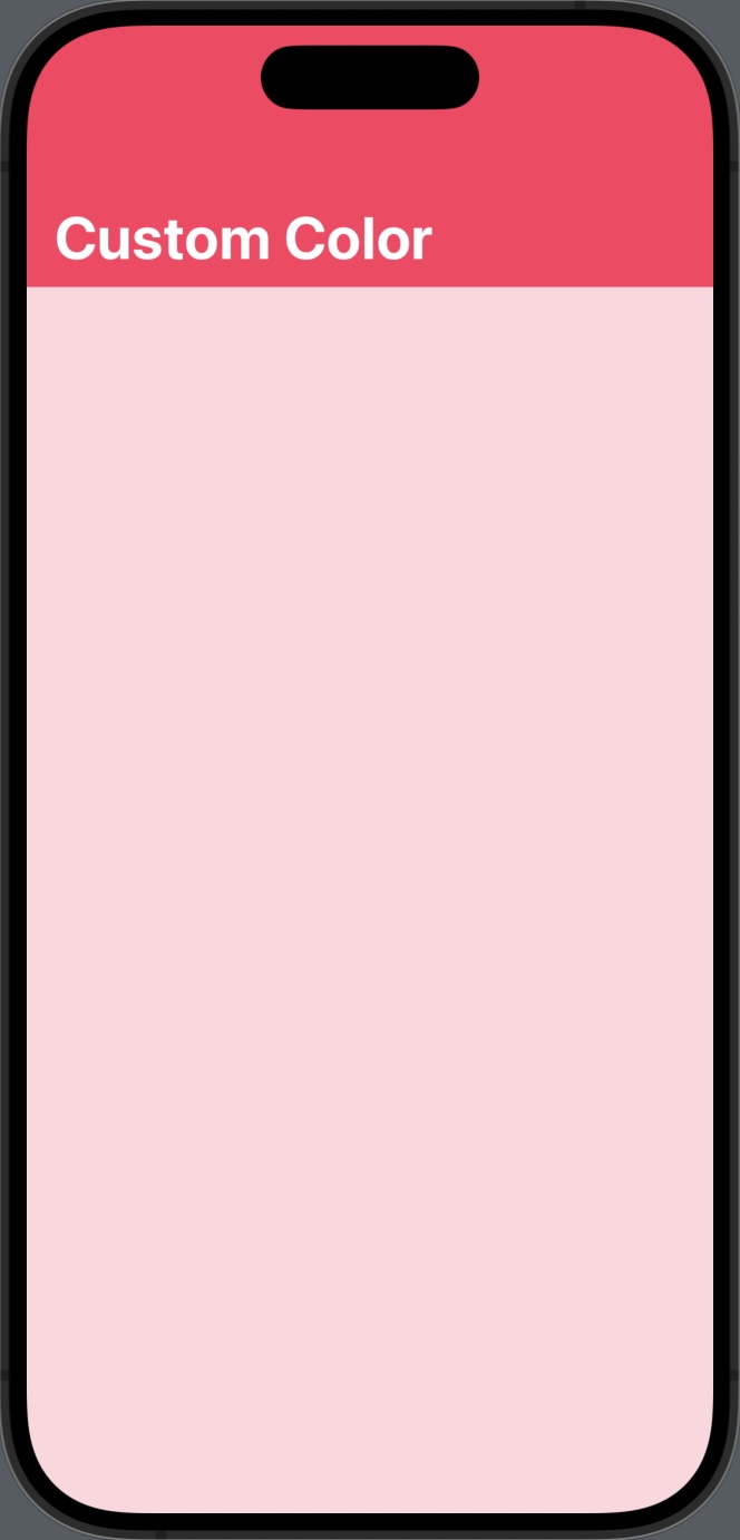
By default, NavigationStack’s bar is translucent, taking on the background color’s of sub-views in the stack.
