SwiftUI Button
Published on April 1, 2024
Imagine a world where graphical user interfaces didn’t have the concept of a button. After all, what would our graphical programs even look like without an obvious way to interact with them? (My guess, we’d just be shipping CLI’s in purpetuity).
Here’s a crash course in utilizing SwiftUI Button’s for your iOS and macOS apps:
Creating a Button
With SwiftUI, we can create a button with laughable ease:
Button("Hello") {
    print("hi!")
}
SwiftUI.Button can be thought of as a visual container that reacts to input. Customizing the visuals of Button can be conceptually split into two subcategories:
- What does the container look like? (background, edges, size)
- What visual elements exist inside the container? (text, images, views and their layout specifics).
Our button container is manipulated declaritively through SwiftUI’s varied collection of ViewModifier’s, just like any View:
Button("Hello") {
    print("hi!")
}
.buttonStyle(.borderedProminent)
.tint(.purple)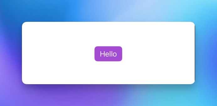
Button Initializers
A button’s internals can be as minimal as you’d like, beyond the String initializers shown above, convenience initializers are available for common usecases, like displaying a string and icon:
Button("Balloons", systemImage: "balloon.2.fill") {
    print("hooray!")
}
.buttonStyle(.borderedProminent)
.tint(.purple)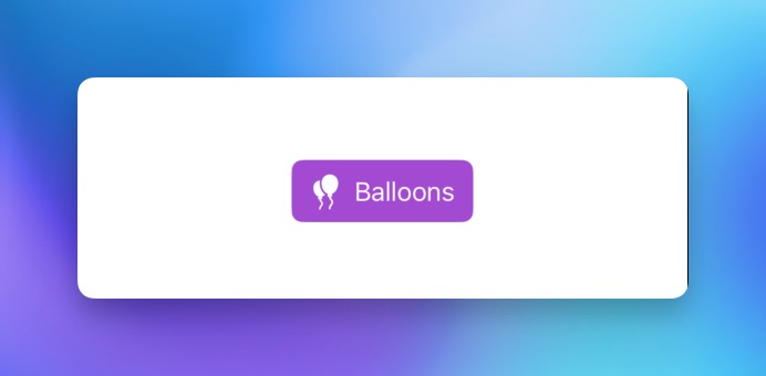
We can also include whole view hierarchies within a button by using the Button(action:, label:) initializer:
Button(
    action: {
        print("too much going on in this button...")
    },
    label: {
        VStack(alignment: .leading, spacing: 2) {
            HStack {
                Text("Button's can do")
            }
            HStack {
                Text("- stacks")
            }
            HStack {
                Text("- images")
                Image(systemName: "balloon")
            }
            HStack {
                Text("- and more")
                Group {
                    Circle()
                    Rectangle()
                }
                .frame(width: 20, height: 20)
            }
        }
        .padding(4)
    }
)
.buttonStyle(.borderedProminent)
.tint(.purple)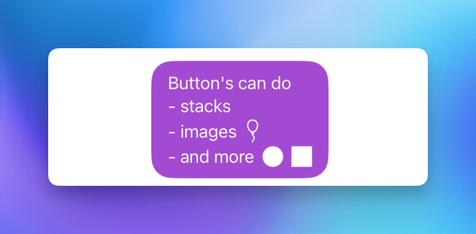
Apple’s documentation defines a label as being a “user interface element that consists of an icon and a title”. While the Label initializer above does not show it, Label is a concrete type that can be initialized directly:
Button(
    action: {
        print("🎈")
    },
    label: {
        Label {
            Text("Happy Spring!")
                .font(.body)
                .foregroundColor(.white)
        } icon: {
            Circle()
                .fill(.blue)
                .frame(width: 44, height: 44, alignment: .center)
                .overlay(Image(systemName: "balloon"))
        }
    }
)
.buttonStyle(.borderedProminent)
.tint(.blue.opacity(0.75))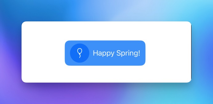
It’s highly recommended to use Button and Label in unison where possible (or the string + icon convenience initializers, which build a Label under the hood). This provides several key benefits:
- Button’s that use Label adapt their appearance contextually when contained in toolbars or menus.
- Label usage helps with accessibility, ensuring that VoiceOver descriptions remain intact when only part of a Label element is visible.
Defining a Button Role
A button can be given a semantic purpose through the use of the role initializer value, which triggers dynamic appearance changes depending on the container’s context. Two ButtonRole’s are provided by default:
- destructive, denoting a destructive user action.
- cancel, describing an action that cancels an operation.
Here’s an example of how a system alert handles rendering it’s buttons, depending on ButtonRole:
Button("Alert") {
    alertPresented.toggle()
}
.buttonStyle(.borderedProminent)
.tint(.blue)
.alert("Simple alert", isPresented: $alertPresented) {
    Button("Cancel", role: .cancel, action: {})
    Button("Default", action: {})
    Button("Delete", role: .destructive, action: {})
}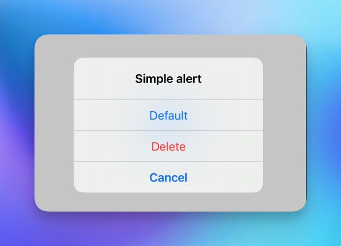
There’s a couple subtle bits of magic at work here that may not be obvious.
First, the cancel button while defined first, appears at the bottom of the alert modal and is presented in bold text. iOS enforces that a button defined with ButtonRole.cancel will always appear last, and denotes an action that will safely exit the current state without lasting effects.
Second, the delete button appears red after being defined as ButtonRole.destructive. This is to provide emphasis to an action that has potentially irreversible effects.
Third, the default button is rendered normally, since it has no specified role.
Reusing Button Styles
In a production setting, we typically want to style our controls consistently. SwiftUI provides the ButtonStyle protocol, which is designed to encapsulate styling intended for reuse for any of our Button implementations:
struct PrimaryButtonStyle: ButtonStyle {

     public init() {}

     public func makeBody(configuration: Configuration) -> some View {
         return configuration.label
             .frame(maxWidth: .infinity, minHeight: 50)
             .background(.blue)
             .foregroundStyle(.primary)
             .cornerRadius(12)
             .font(.body.weight(.semibold))
             .scaleEffect(configuration.isPressed ? 0.97 : 1)
             .animation(.easeOut(duration: 0.1), value: configuration.isPressed)
     }
}
Encapsulating our styles this way also gives us some added capabilities through the ButtonStyleConfiguration, which is passed to the makeBody(configuration:) function. This configuration object is built under the hood of all Button’s when initialized.
ButtonStyleConfiguration primarily provides access to the role, isPressed and label values of the button. This gives us the oppurtunity to inspect and apply conditional styling rules that depend on these values. An example of this can be seen above, through the addition of .scaleEffect() based on the configuration.isPressed value.
In tandem with the ButtonStyle protocol is the .buttonStyle(_ style: S) modifier. This provides a consistent, native way to compose our styles with any Button implementation:
Button("🤘") {
    print("🚀")
}
.frame(width: 320)
.buttonStyle(PrimaryButtonStyle())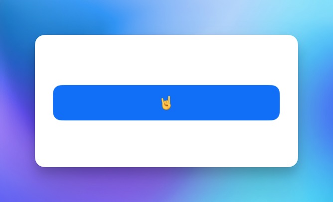
Styling components this way ensures that we are keeping our app modular, consistent and composable. Doing so is a sign of good style and craftspersonship – your engineering colleagues and future self will appreciate it.
